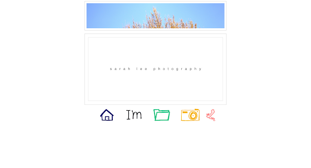
using my logo - sarah lee photography for index.
Also, I draw some icon for the menu page. ''home'' ''about me'' ''portfolio'' ''gallery'' and ''contact''.

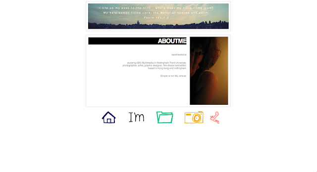
About me
the header is changing every page. It is because every page have their own meaning to express.

Portfolio
user can scroll it at the middle. Photo will smooth to bigger when user use mouse over it.
Gallery page
flickr update every moment.
Contact
My main ideas and intentions that I was trying to express in the project were:
Using Adobe Dreamweaver to design a 5 page interactive website as an online portfolio. My main idea is using this website to express art and myself. I am still finding the way of my style. This is a good way to show people my work immediately.
The user that I tag is everyone, who wants to know Sarah Lee more, wants to know her work more. Everyone can share the art online.
The methods I use to develop my ideas were: (brainstorming, , visual research, storyboards etc)
I used wire frame to brainstorming my idea. Changing every time, every moment. For example, the footer of my website is the menu bar – home, about me, portfolio, photos, news and contact. This is my first idea of the footer. I changed again. My final idea of that is using icon which is I draw instead of words.
I took a risk by trying something new. (Explain):
I researched difference website. They are using JavaScript and Flash. They are smooth and make the things look good. I try to use it, but they are hard to learn. Then I found out that same effect that I could create in CSS and html.
Some of the unexpected problems I had to solve while working were:
I am not using Dreamweaver a lot and I am not good at coding. This time, I need to learn to use coding to design my website. Coding is a big problem for my website. I am not expected that layout and coding are hard to control. Seems they are simple layout. It is hard to work out. Beside, image is the big problem as well. I am not expected the images are so big when I put it on the webpage.
The decisions and choices I made to help solve these problems were:
Usually, when I have problem of the coding, I will search online and magazines. And ask people that might know about Dreamweaver. When I found the solution to solve the problem, I will refresh the webpage again and again if it is still not work out. Try and try the coding many times to make the things good.
For the images, I will use Photoshop to resize the image to get it smaller, that can fit on the webpage.
The things I have learnt from this particular project were: (Specific examples should be cited.)
Time management is the important things. My final idea was finish one week ago, that are so late for build up the website. If the idea was late, everything of your schedule will be late. For example, collect photo for your website, create some image it spent a long time.
Coding – I have learnt coding a lot. I thought that some effects are only creating in Flash. But, I know that CSS and html can create like a Flash effect, right now.
Areas for improvement , If I were to do this project again I would change or do differently:
1. Add comment and contact for visitor – this is the important part for the artist. Artists always need to listen others comment and get improve.
2. Change the menu button – I will add words to the button and add animation in the button. When the mouse comes over the home icon, it will change to the word “home”.
A new project that might grow out of my experience maybe:
I will keep thinking my idea, brainstorming and keep research for my 3D animation.


